


Living Room Painting Ideas: A Complete Guide
The living room is often the heart of a home — where guests are entertained, families gather, and personal style shines through. Choosing the right paint color can elevate the ambiance, reflect your personality, and even make the space feel larger or cozier. Below are inspiring living room painting ideas to help you transform your space.
1. Color Psychology: Setting the Mood
Different colors evoke different emotions. Understanding this can help you create a living room that feels just right.
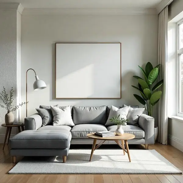
Neutral Tones: Neutral tones refer to colors that are not strongly saturated and tend to blend well with a wide range of other hues. These include shades such as beige, gray, ivory, and soft whites. Neutral tones are often associated with calmness, simplicity, and sophistication. They provide a timeless backdrop in fashion, interior design, and art, allowing other colors or elements to stand out. Because of their versatility, neutral tones are widely used to create balanced and harmonious spaces or compositions, evoking a sense of tranquility and understated elegance. Whites, beiges, and greys are timeless and versatile. They create a calming and spacious atmosphere.
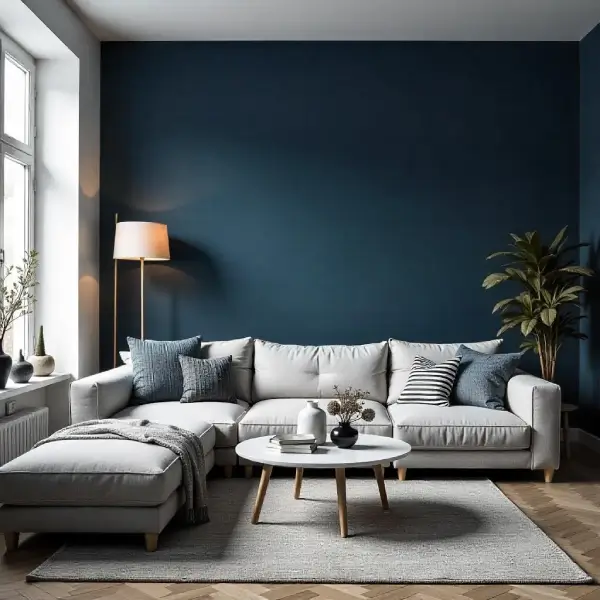
Blues: Blue is a color often associated with calmness, stability, and depth. It is commonly seen in nature, from the vast sky to the deep ocean, evoking a sense of tranquility and serenity. Psychologically, blue is known to have a soothing effect, often used to reduce stress and promote relaxation. It is also linked to qualities like trust, intelligence, and responsibility, which is why many corporate logos and uniforms use shades of blue. Whether in art, design, or everyday life, blue stands out as a timeless and versatile color with powerful emotional and cultural significance. Calming and serene, ideal for a relaxed environment. Lighter blues for airiness, darker navy for sophistication.
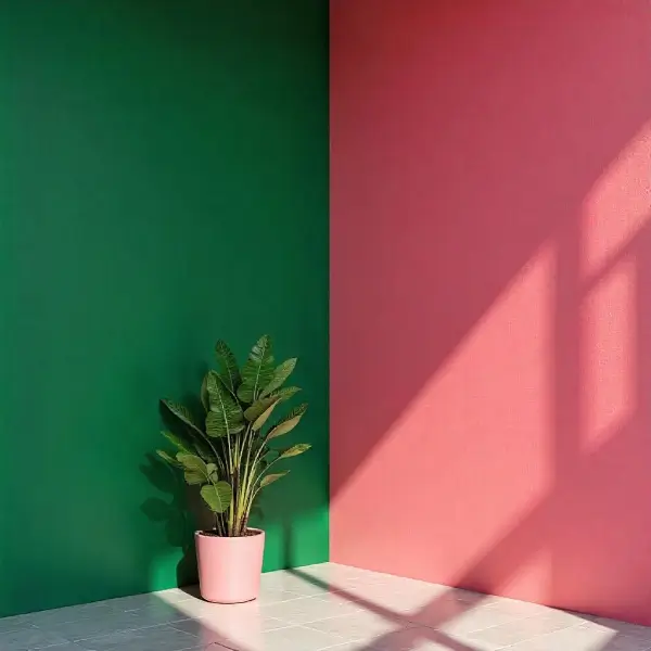
Greens: Green is a color often associated with nature, growth, and renewal. It symbolizes life, freshness, and harmony, making it a calming and peaceful color to the human eye. Found abundantly in the natural world—in trees, grass, and plants—green represents health, balance, and sustainability. Psychologically, it can evoke feelings of tranquility and reassurance, often used in spaces meant to relax or soothe. In many cultures, green also carries meanings of prosperity, fertility, and good luck. Its strong connection to the environment has made it a symbol of eco-friendliness and environmental awareness in modern times. It evoke nature and freshness. Sage or olive green adds depth without overpowering.
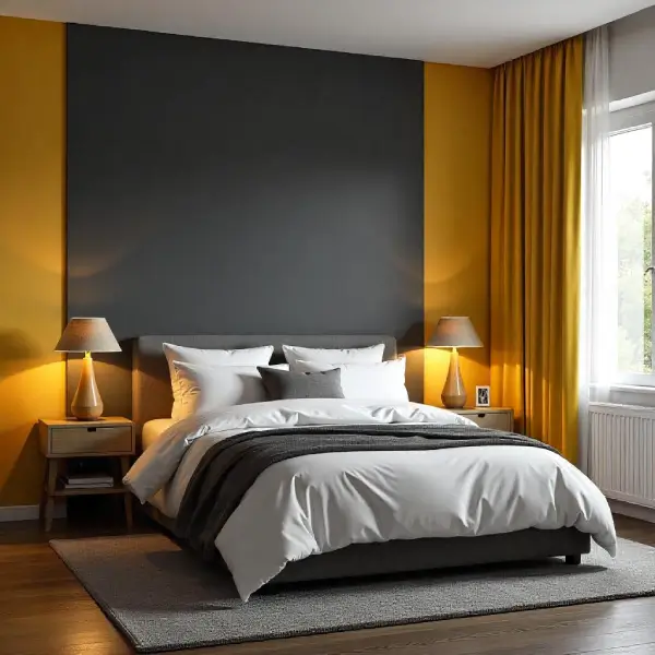
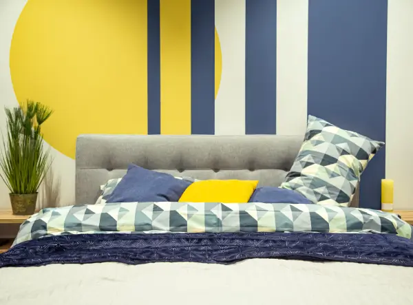
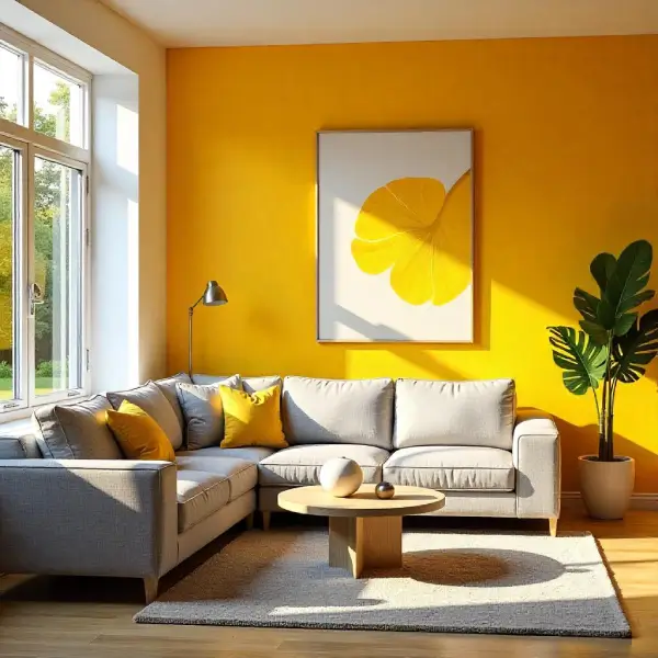
Yellows: Yellow is a bright and cheerful color often associated with sunlight, warmth, and happiness. It is one of the most visible colors to the human eye, making it effective for drawing attention and conveying a sense of energy or alertness. In nature, yellow appears in flowers like sunflowers and daffodils, symbolizing freshness and new beginnings. Culturally, it can represent optimism and creativity, though in some contexts, it may also signify caution or warning, as seen in traffic signs. Overall, yellow brings a lively and uplifting presence to any setting. Cheerful and bright, perfect for energizing a dark space. Mustard tones offer warmth and a retro feel.
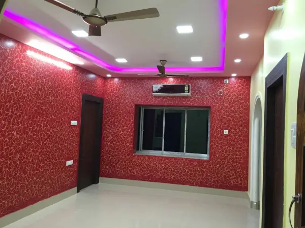
Reds & Oranges: Red and orange are warm, vibrant colors often associated with energy, passion, and enthusiasm. Red is a bold, intense color that symbolizes love, strength, and urgency, frequently used to grab attention or convey strong emotions. Orange, a blend of red and yellow, carries the energy of red with the warmth and cheerfulness of yellow. It often represents creativity, excitement, and optimism. Together, these colors can evoke a sense of warmth and dynamism, making them popular choices in art, fashion, and design to create lively and stimulating visuals. Both this color are bold and stimulating. Best used as accents or in moderation.
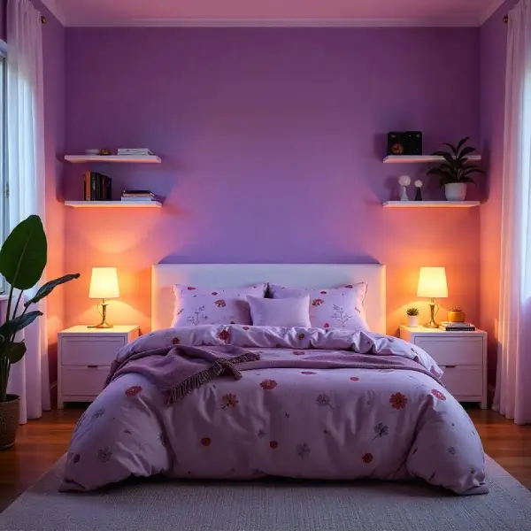
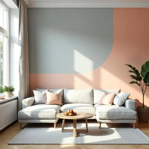
Purples: Purple is a color often associated with royalty, luxury, and mystery. It combines the calm stability of blue and the fierce energy of red, creating a hue that is both soothing and bold. Historically, purple dye was rare and expensive, making it a symbol of wealth and power in many cultures. In nature, purple appears in vibrant flowers, twilight skies, and rare gemstones, adding to its sense of magic and wonder. Today, purple is also linked with creativity, spirituality, and individuality, making it a favorite in art and design for those who seek to express uniqueness and depth. Associated with luxury and creativity. Soft lavender adds calm, while plum adds richness.
2. Trending Color Combinations
Stay current with these stylish and balanced wall color combinations:
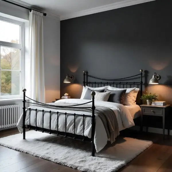
Charcoal Grey + Soft White: The grey and white color combination offers a timeless and sophisticated aesthetic that effortlessly blends modernity with elegance. Grey brings depth, neutrality, and a calming presence, while white adds brightness, purity, and a sense of spaciousness. Together, they create a balanced and harmonious palette that works well in both interior design and fashion. This duo is versatile—equally suited for minimalist, contemporary spaces as it is for classic or industrial styles. Whether used in clothing, branding, or decor, the grey and white combination exudes understated confidence and refined simplicity.
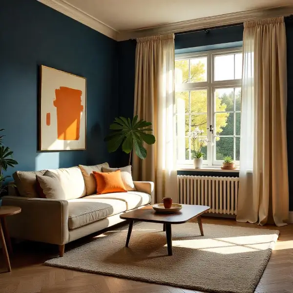
Navy Blue + Warm Beige: Navy blue and beige create a timeless and sophisticated color combination that balances depth with softness. Navy blue, with its rich, dark hue, evokes a sense of strength, stability, and elegance, often associated with authority and professionalism. Beige, on the other hand, offers a warm, neutral contrast, bringing in a sense of calm, simplicity, and understated charm. When paired together, navy blue and beige strike a harmonious blend—perfect for interior design, fashion, and branding—offering both visual interest and versatility. This duo works well across seasons and styles, making it a classic choice for both modern and traditional aesthetics. Creates contrast and coziness.
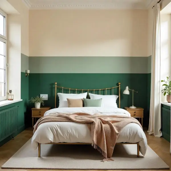
Sage Green + Cream: Green and cream is a soothing and elegant color combination that evokes a sense of calm and natural beauty. Green, often associated with nature, renewal, and tranquility, pairs harmoniously with cream, a soft and neutral shade that adds warmth and sophistication. Together, they create a balanced and refreshing palette that is often used in interior design, fashion, and branding to convey freshness, serenity, and understated elegance. Whether in a cozy living space or a stylish outfit, green and cream work together to create a timeless and inviting aesthetic. Earthy and fresh, perfect for biophilic or farmhouse styles.
Dusty Rose + Deep Green: Dusty rose and deep green form a rich, sophisticated color pairing that blends soft romance with grounded elegance. Dusty rose, a muted pink with hints of mauve, brings warmth and subtle femininity, while deep green adds depth and a sense of nature-inspired calm. Together, these colors evoke a timeless aesthetic, often used in weddings, interior design, and fashion to create a balanced atmosphere that feels both modern and classic. The contrast between the gentle blush of dusty rose and the bold, earthy tone of deep green makes this duo visually striking yet soothing, perfect for settings that aim to be inviting and refined. Trendy and elegant, great for artistic interiors.
Terracotta + Off-White: Terracotta and off-white are a beautiful and complementary color combination often used in interior design, fashion, and art. Terracotta, with its warm, earthy reddish-brown hue, evokes a sense of natural clay and rustic charm, bringing warmth and depth to any space or outfit. Off-white, a soft and subtle shade of white with a hint of cream or beige, provides a gentle, neutral backdrop that balances the richness of terracotta. Together, these colors create a harmonious blend of warmth and calmness, making spaces feel inviting and cozy while maintaining a clean and sophisticated look. Whether used in ceramics, textiles, or wall colors, terracotta and off-white offer a timeless palette that connects the natural world with elegant simplicity.
3. Accent Wall Ideas
Adding a feature wall can give your living room depth and personality.
Bold Color Accent: A bold accent color combination brings energy and visual impact to any design or space. It involves pairing vivid, contrasting hues—such as electric blue with off-white or some soft color, or deep magenta with light green—to create a dynamic and eye-catching aesthetic. These bold pairings are often used to highlight focal points, draw attention to key elements, or inject personality into a more neutral or monochromatic base. When used thoughtfully, bold accent color combinations can transform ordinary designs into memorable statements, evoking strong emotions and enhancing overall visual appeal.
Textured Paint Effects: Textured paint effects add depth and character to walls and surfaces by incorporating physical texture into the paint finish. These effects can range from subtle, sandy grains to bold, raised patterns that mimic materials like stone, fabric, or stucco. They are often used to create visual interest, hide surface imperfections, or bring warmth and dimension to a room. Techniques such as sponging, ragging, and combing can be used to achieve various textures, while specialty textured designs such as dune, safari, and antico have more pronounced effects. Textured paint is popular in both modern and rustic interior designs, offering a unique alternative to flat, smooth finishes. Combining texture design with plain colors give an aesthetic appeal to your interior. Try Asian paints royale play sponging design, ragging design, or metallic finishes for visual interest.
Geometric Patterns: Geometric patterns are designs composed of shapes such as circles, squares, triangles, and other polygons, often repeated or arranged in symmetrical, organized ways. These patterns are a fundamental element in art, architecture, and design, valued for their balance, harmony, and visual appeal. Found in both natural and man-made environments, geometric patterns can range from simple tessellations to intricate motifs seen in Islamic art, mosaics, and modern graphic design. Their mathematical precision not only enhances aesthetics but also conveys a sense of order and structure.
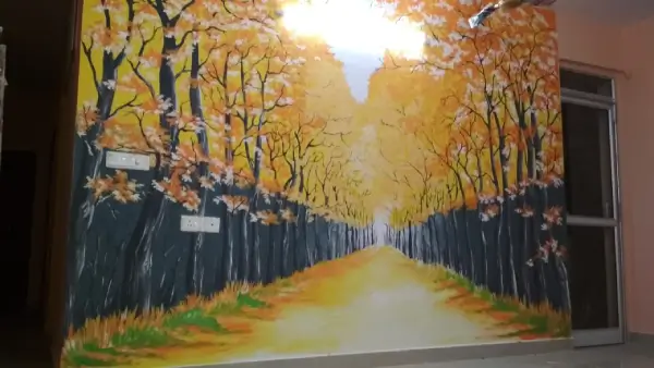
Murals or Wall Art Paint: Murals or wall art paint serve as powerful forms of visual expression, transforming blank walls into captivating stories or cultural statements. They not only beautify the home interior but also engage viewers, evoke emotion, and brings aesthetic appeal to your home. Whether painted by renowned artists or local talents, murals have the ability to inspire, provoke thought, and bring people together through shared visual experience.
4. Two-Tone Walls
Divide your wall horizontally using two complementary colors. Common combinations include:
White on top, navy on bottom for a nautical look.
Pale grey over charcoal for subtle dimension.
Use chair rails or molding to separate tones for a polished finish.
5. Ceiling and Trim Paint Ideas
Don't ignore the "fifth wall" and the edges of your room:
Painted Ceilings: A soft pastel or matching wall tone can lower or lift the perceived ceiling height.
Contrasting Trim: Use grey, navy, or gold for a dramatic edge, or stick with bright white for a classic contrast.
Color Drenching: Paint the walls, trim, and ceiling the same color for a cohesive and immersive feel.
6. Finish Selection (Matte, Satin, Gloss)
Matte finish: Great for hiding imperfections; best for low-traffic living rooms.
Eggshell or Low sheen: Slightly reflective, durable, and easy to clean — perfect for most living rooms.
Mid-sheen or High-sheen: Shiny and durable; often used on living rooms walls for accent effects.
7. Small Living Room Paint Ideas
To make a small living room feel larger:
Use light and cool tones like soft greys, pale blues, or off-whites.
Paint the ceiling lighter than the walls to open up the space.
Color continuity: Using the same color on walls and trim can make the room feel seamless and bigger.
8. Large Living Room Painting Tips
Large spaces can feel cold or overwhelming. Consider:
Warm tones like yellow, purple, and green to cozy things up.
Contrast with paint: Use different colors or tones to define areas (e.g., a reading nook or entertainment section).
Dark tones: These can make expansive rooms feel more intimate when used wisely.
9. Eco-Friendly and Non-Toxic Paint Options
Choose low-VOC or zero-VOC paints for better indoor air quality.
Brands like Asain Paints, Berger Paints, and Nerolac Paints offer eco-friendly options.
10. Painting Tips and Tools
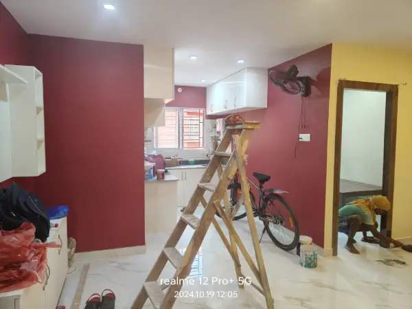
Prep thoroughly: Prepare your wall properly before painting. The steps involved in preparing a perfect surface includes proper sanding of the surface, then applyig putty to make it smooth, filling up he cracks if any, then applying primer for a better adhesion and lastly applying paint.
Test samples: For a better understanding of color you can paint swatches on walls and observe them in different light throughout the day.
Use quality brushes and rollers: Better tools give better results.
Apply proper coats: Do not apply multiple coats of paints. Use only 2-3 coats of paint to get a better finish. Multiple coats can lead to paint flaking in future.
BEST LIVING ROOM DESIGNS FROM RAINBOW KOLORS
At Rainbow Kolors we have various wall painting designs for living room from where you can select the best for your living area. We have a dedicated color consultancy team who will also guide you to choose the best color combination for your living room. We have differnet wall painting designs available especially for living rooms, from normal accent wall to texture designs, unlimited wallpaper designs, mural or artistic design, 3d epoxy wall designs and various other design option you would get. You can also enhance the look of the living room by adding some false ceiling design to ccompliment it with the living room color. We can add some color good combination on the false ceiling matching it with the walls to give it an aesthetic appeal.
DIFFERENT LIVING ROOM PAINTING COLOR COMBINATION
Choosing the right color combination for a living room can significantly influence the ambiance and style of the space. A classic choice is a neutral palette, with shades like beige, cream, and soft gray creating a calm and timeless atmosphere. For a more vibrant and modern look, combining navy blue with mustard yellow adds both depth and energy. Earthy tones such as terracotta paired with olive green bring warmth and a natural, grounded feel. If you're aiming for a bold and dramatic aesthetic, black accents with jewel tones like emerald or deep burgundy can make a strong statement. Alternatively, pastel combinations—such as blush pink and light mint—offer a soft, airy vibe perfect for smaller or sunlit spaces. The key is to balance color intensity with lighting and furniture to create a cohesive and inviting environment.
BEST LIVING ROOM PAINTING IDEAS
When it comes to living room painting ideas, the right color can completely transform the atmosphere of the space. Soft neutrals like beige, taupe, or light gray create a calm and inviting environment, making them ideal for a cozy and elegant look. For a bolder statement, rich hues such as navy blue, forest green, or deep burgundy add depth and sophistication, especially when paired with complementary furniture and décor. Accent walls can introduce visual interest without overwhelming the room—try a splash of mustard yellow or terracotta behind a sofa or fireplace. For a modern twist, consider color-blocking or geometric patterns using contrasting shades. Ultimately, the best living room paint colors reflect your personal style while enhancing comfort and harmony in the heart of your home.
LATEST LIVING ROOM PAINTING TEXTURE DESIGNS
In 2025, living room texture designs are embracing a blend of natural elements, bold patterns, and sustainable materials, reflecting a shift towards tactile and personalized interiors.
Natural and Earthy Finishes
Natural and earthy paint finishes are inspired by the tones and textures found in nature, offering a warm, organic feel to interior and exterior spaces. These finishes often use eco-friendly, non-toxic materials like clay, lime, and milk-based paints, which are both breathable and sustainable. The color palette typically includes muted greens, soft browns, sandy beiges, and warm terracottas—shades that create a calming, grounded atmosphere. Texturally, these finishes can range from smooth matte to subtly weathered or chalky surfaces, adding depth and character to walls. Ideal for creating serene, nature-connected environments, natural and earthy paint finishes blend aesthetic beauty with environmental responsibility.
Bold and Geometric Patterns
Bold and geometric patterns are striking design elements characterized by strong lines, sharp angles, and repetitive shapes. These patterns often use high-contrast colors and symmetrical arrangements to create a visually impactful and modern aesthetic. Frequently found in contemporary art, fashion, and interior design, bold geometric designs convey a sense of structure and order while making a powerful visual statement. Their rhythmic repetition and clean forms can energize a space or outfit, adding both sophistication and dynamism. Whether used in wallpaper, textiles, or graphics, geometric patterns remain a timeless and versatile design choice.
Metallic Finishes
Metallic finishes are surface treatments that give materials a shiny, reflective, and often luxurious appearance, mimicking the look of metals like gold, silver, bronze, or chrome. Commonly used in automotive design, interior décor, fashion, and electronics, metallic finishes enhance aesthetic appeal and can convey a sense of sophistication or modernity. These finishes can be achieved through various techniques such as electroplating, powder coating, or metallic paint. Beyond their visual impact, some metallic finishes also offer practical benefits like improved durability, corrosion resistance, and ease of cleaning, making them both functional and decorative.
Sustainable and Eco-Friendly Paints
Sustainable and eco-friendly paint is designed to minimize environmental impact and promote healthier living spaces. Unlike conventional paints that often contain harmful volatile organic compounds (VOCs), eco-friendly paints are made from natural, non-toxic ingredients and low-VOC or zero-VOC formulations. These paints reduce indoor air pollution, making them safer for both humans and the environment. Additionally, many sustainable paints are produced using renewable resources and packaged in recyclable materials, further lowering their carbon footprint. By choosing eco-friendly paint, consumers contribute to a cleaner environment while enhancing the safety and sustainability of their homes and workplaces.
If you want to renovate your living room according to the latest trends and fashions, you have come to the right place! Aapkapainter offers the best simple wall painting designs for living rooms. We can give you elegance and classiness as well as quirk and cheerful. Check out the best living room texture paint to have a unique effect on your walls. You can also choose special wall art for the living room. On top of that, there are endless options for wall colour combinations for the living room to explore. Explore all these amazing living rooms wall painting ideas now!
LIVING ROOM COLOUR COMBINATIONS FOR YOUR HOME
A well-chosen living room color combination can transform the space into a warm, inviting area that reflects your personality and enhances comfort. One timeless option is a neutral palette—think shades of beige, cream, and soft gray—which creates a calm and sophisticated ambiance, serving as a perfect backdrop for accent pieces. For a bolder look, pairing navy blue with crisp white adds contrast and depth, while incorporating touches of gold or brass brings in elegance. Earthy tones like terracotta, olive green, and warm browns evoke a cozy, natural feel, ideal for a grounded and relaxed environment. Ultimately, the key is to balance light and dark shades while integrating colors that complement your furniture and lighting to create a harmonious and visually appealing space.
LATEST WALL PAINTING DESIGNS FOR LIVING ROOM
The latest wall painting designs for living rooms emphasize modern aesthetics, bold creativity, and subtle sophistication. Trending styles include geometric patterns in muted or pastel tones, abstract art with textured brushstrokes, and minimalist line art that adds elegance without overwhelming the space. Nature-inspired murals, such as botanical illustrations or mountain landscapes, are also gaining popularity, bringing a calming outdoor vibe indoors. For a more personalized touch, many homeowners are opting for custom accent walls with ombré gradients or artistic splashes that reflect their personality. These contemporary designs not only enhance the visual appeal of the living room but also serve as conversation starters.
BEST TEXTURE PAINT FOR YOUR LIVING ROOM
Wall texture design in a living room plays a crucial role in setting the tone and enhancing the overall ambiance of the space. Textured walls can add depth, warmth, and personality, transforming a plain area into a visually engaging focal point. From metallic finishes like royale play ragging design, canvas effect, spatula design to bold statements with marble design, brick wall design, or 3D wall texture, each design choice contributes to the room’s character. Textures can also be used strategically to complement natural light, highlight architectural features, or create a cozy, inviting environment. Whether modern or rustic, the right wall texture can elevate the aesthetic and comfort of a living room.
LATEST STENCIL PAINTS FOR LIVING ROOM
The latest stencil designs for living rooms embrace a blend of modern minimalism and artistic flair, offering a fresh take on wall decor. Popular trends include geometric patterns, nature, full wall stencils and abstract line art, all designed to add depth and personality without overwhelming the space. Metallic and matte finishes in neutral tones like beige, gray, and sage green are especially in vogue, lending a sophisticated touch. These designs often serve as feature wall accents, creating a focal point behind sofas or entertainment units. With easy application and customizable patterns, stenciling is becoming a go-to choice for homeowners seeking a stylish yet budget-friendly upgrade.
LIVING ROOM PAINT PRICE AND COLOUR
To know about the price and color of your living room painting, you just need to make a call to us or you can mail us your enquiry. Our sales team will get in touch with you for a free site visit for estimate. Once you agree to do the wotk with us our color consultant would help you in finalizing the best color for your living room.
WHY CHOOSE RAINBOW KOLORS FOR PAINTING YOUR LIVING ROOM
With almost 10 years of painting experience and expertise in interior painting and exterior painting you can trust Rainbow Kolors home painting company for any painting needs. There painters are all trained and professional who make sure to deliver a perfect finishing. They provide interior painting, exterior painting, waterproofing solutions, wallpaper installation service, repairing, texture design, stencil design and other painting related solutions.
Conclusion
Before painting your living room consider some professional to guide you through for selecting the best color combination for walls. You can approach Rainbow Kolors home painting company for living room painting of your home. They have professional color consultancy team who can help you to choose the right color combination for your hall.
